2.2 Principles of Graphic Design
Graphic Design Principles

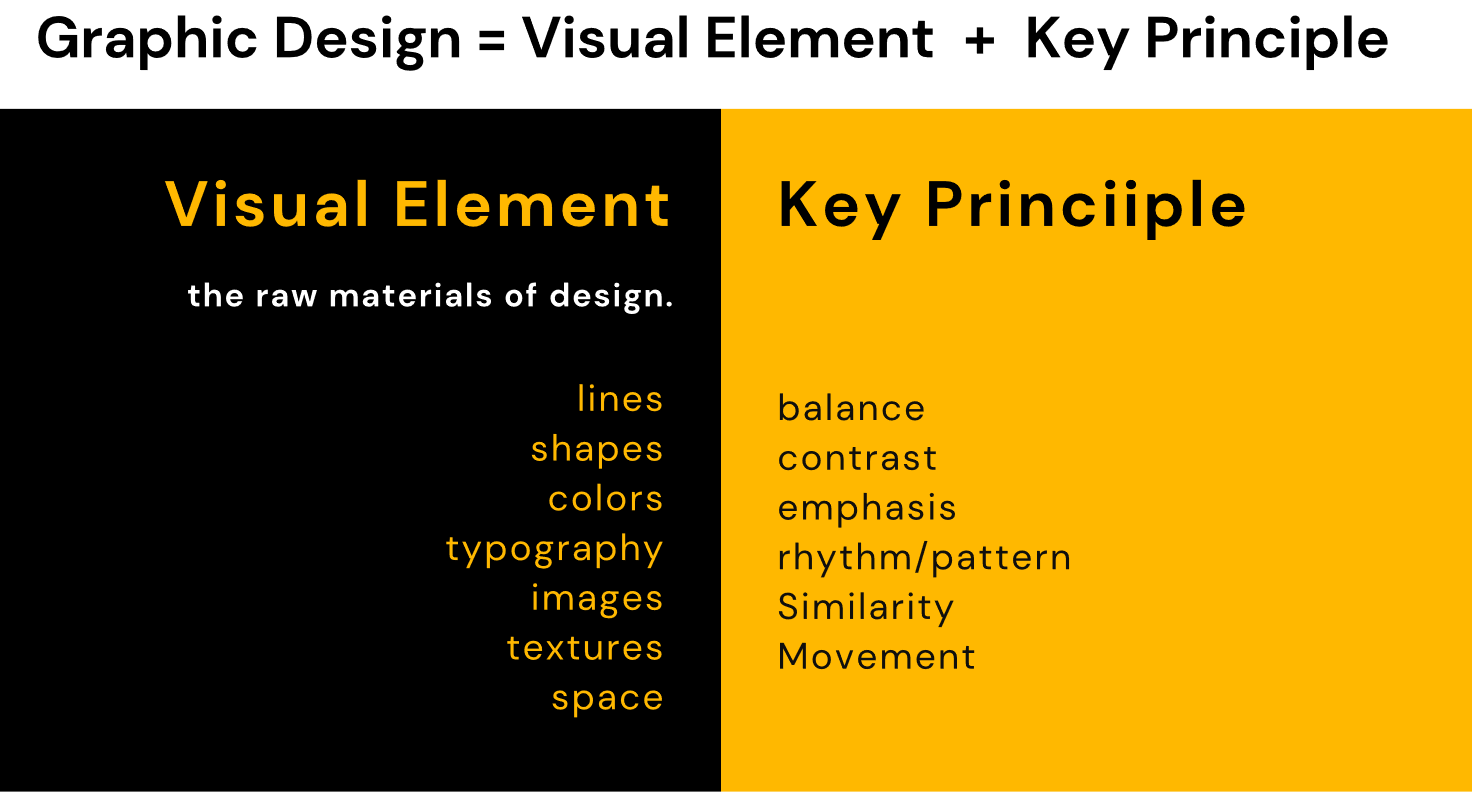
When you are Graphic Designers there are some design principles that you must know to create harmonious and good designs. These principles will help your designs to communicate clearly your ideas and how all the graphic elements of your design interact with each other.
1. Contrast
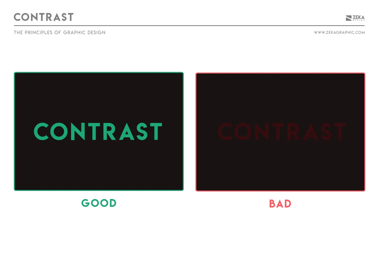
Contrast is one of the most common Graphic Design Principles and every graphic designer must dominate it, contrast refers to the difference between the elements in your design, mean for example in a color that if you use a dark color in one element, the other graphic elements need to be in a light color to easily differentiate from the other.
For example, if you create a graphic design with a text, and the background of your design is Dark, then the text color needs to be in a light color to make it easier to read.
2. Balance
If you are a Graphic Designer and you are working on a design project you need to know that every element you place in your design has a weight on it, and it can come from color, size, or texture.
Balance refers to how you put these elements on your design and avoid putting all your heavy elements in the same place. There are two types of balance, Symmetrical, which creates balance by aligning equally weighted elements, and asymmetrical design is the opposite, you align a heavy element with lighter ones to create a contrast effect.

3. Emphasis
Emphasis refers to the importance of the elements on your design, and what order they should have on it. What the emphasis principle says is that the most important information that you need to show in your design must be the first thing the people see in your project.
For example in a Movie poster design, the first thing you need to see is the Movie title, then it can be the name of the director and after the name of the actors and actresses

4. Repetition
Repetition is a great tool to reinforce an idea you want to transmit through your design and it also helps to unify your project, you can use the repetition principle in different elements as color, typefaces, shapes, or other graphic design elements.
For example, if your design has multiple typefaces or colors it can be seen as a bad design and uncomfortable to watch due to the chaos, but we can avoid this by choosing two typefaces for example, and using them in all the design.

5. Proportion
The proportion principle in graphic design is one of the easiest to understand, basically, proportion refers is the size of elements to one another in the design. Larger elements are easy to see in design than smaller ones and by this principle, larger elements are more important than smaller ones.

6. Hierarchy
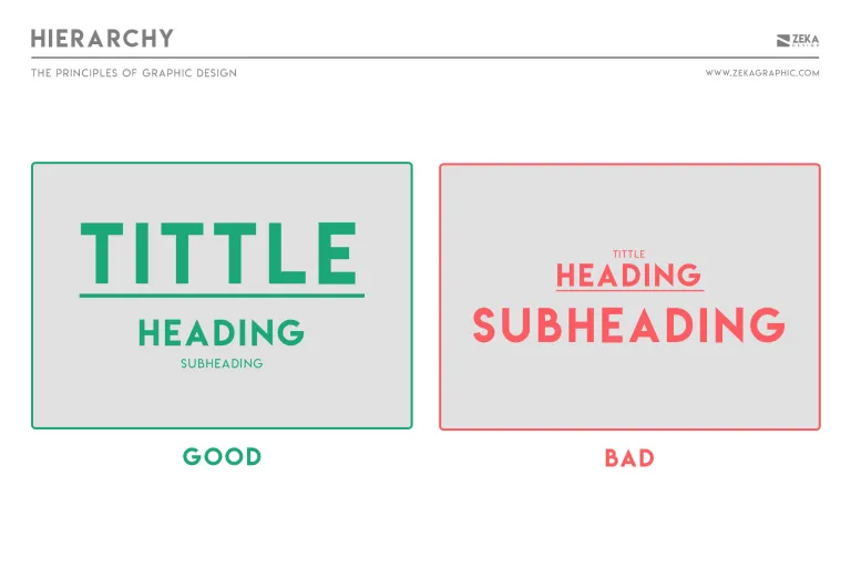
Hierarchy principle in Graphic Design stands out that the most important elements in your design also should appear to be the most important, this help people who will see your design understand better what is the important element on it.
You easily can see a hierarchy example in titles and headings in a design.

7. Rhythm
The rhythm principle is easy to understand by using the music as an example when you are using repeating elements in your design this creates spaces between these elements, and this creates a visual rhythm as this happens in musical compositions. There are five types of visual rhythm: random, regular, alternating, flowing, and progressive.

8. Pattern
The pattern in Graphic Design refers to a repetition of multiple graphic elements on your design working together to create an eye-catching and harmonious design.
Pattern principle is also referred to how design elements are designed in a project and set a standard on it to easily communicate your ideas.

9. White Space
White space is also known as negative space, and it refers to the area of a design that is empty and not include design elements. But white space is actually a really important design element, you need to give your design elements space to breathe and easily differentiate them from other elements.
White space is also used in Logo design to create hidden images on it and give more information about your brand and avoiding to saturate it

10. Movement
The movement principle in graphic design refers to how the human eye interacts with your design, and the most important element in your design must be the first thing people see, and after seeing it your design needs to lead the viewer to the next most important element.

11. Variety
The variety principle is used in design to create visual interest to the viewer and it can be created with different elements as color, typography, images, shapes, and many more. And by using the variety we avoid creating a monotonous design and lose the interest of the viewer.
It’s important to understand that when you use the variety principle you need to be very careful by not overloading your design and create chaos.
12. Unity
Unity principle refers to how well all the elements used in your design project work together, they should have a clear relationship and communicate the same concepts, this will cause that your design looks more organized and every element on it will be related to each other.

Conclusion And Graphic Design Principles Infographic
As I mentioned in the introduction these 12 design principles must be known by every graphic designer, now you can implement these principles on your designs and practice them, this will help your graphic design projects look better and communicate easily your ideas.
And once you have mastered all 12 principles you can start to play with them and using to create unique design and creative ways to communicate your ideas through your graphic design projects!
There are no comments for now.

